Cargill Price Hedging
Role
Lead Product Designer
Responsibilities
UX Product Discovery
UX Strategy
Interaction Design/Prototyping
Overview
Most farms are family-owned and operated, often passed down through generations. However, managing paperwork, accessing trading commodities, and obtaining real-time data remain significant challenges for many farmers.
Since farmers spend most of their day working on the farm, they typically handle budgeting, profit/loss analysis, and commodity trading after hours—traditionally relying on phone calls for these tasks.
Cargill struggled to keep up with the increasing demand on its call center, and the high operational costs of maintaining a large call center became unsustainable.
The initial version of Cargill’s app failed for several reasons, including frequent crashes, connectivity issues, and a cumbersome user experience.
Goals:
Improve Stability and Connectivity – Ensure the app functions reliably by addressing crashes and connection issues, even in areas with limited internet access. Implement offline capabilities where possible.
Enhance User Experience (UX) and Accessibility – Simplify navigation and usability to accommodate farmers who may have limited time and technical expertise. The app should be intuitive, easy to use, and optimized for quick interactions.
Streamline Commodity Trading and Data Access – Provide real-time market data, seamless commodity trading, and easy-to-use budgeting tools to help farmers manage finances efficiently without relying on after-hours phone calls.
Problem Discovery
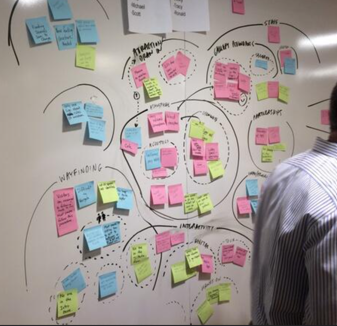
By identifying knowledge gaps and key questions within the problem space, we develop a discovery plan with human-centered design (HCD) activities, such as affinity clustering, to uncover insights and address those gaps. Once aligned we met with primary users for ethnographic research.
User research was a fundamental part of the design process, and I took a highly immersive approach through ethnographic research with farmers in their everyday environments.
Through these interactions, The product team was able to uncover pain points, needs, and motivations. In addition to interviews, we put the farmers daily routine into journey maps.
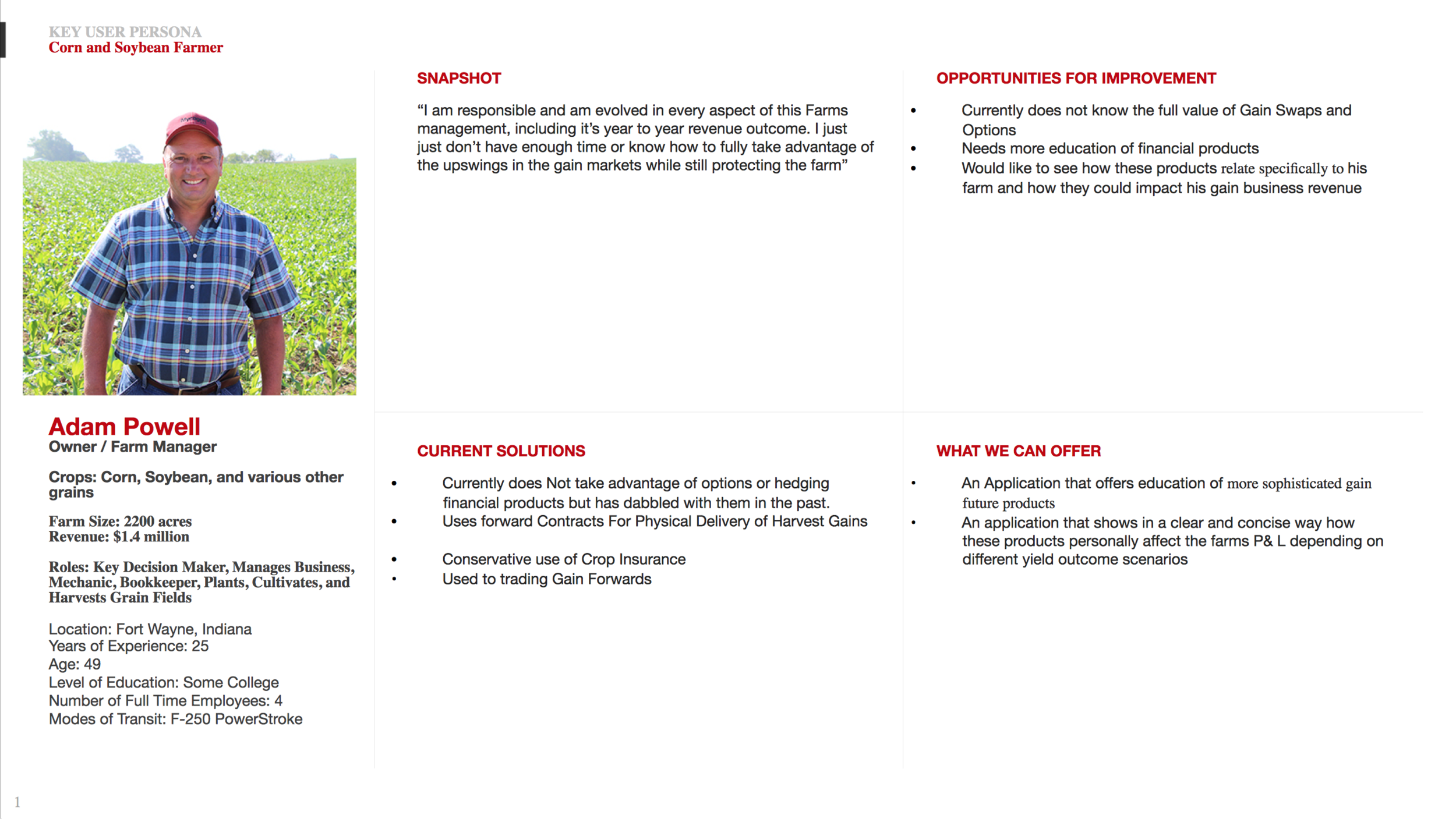
Our primary users were out in the fields doing the work, managing their crops, their farms, and their families.The last thing they wanted to think about was how to use an app.
Interactive HCD Sessions
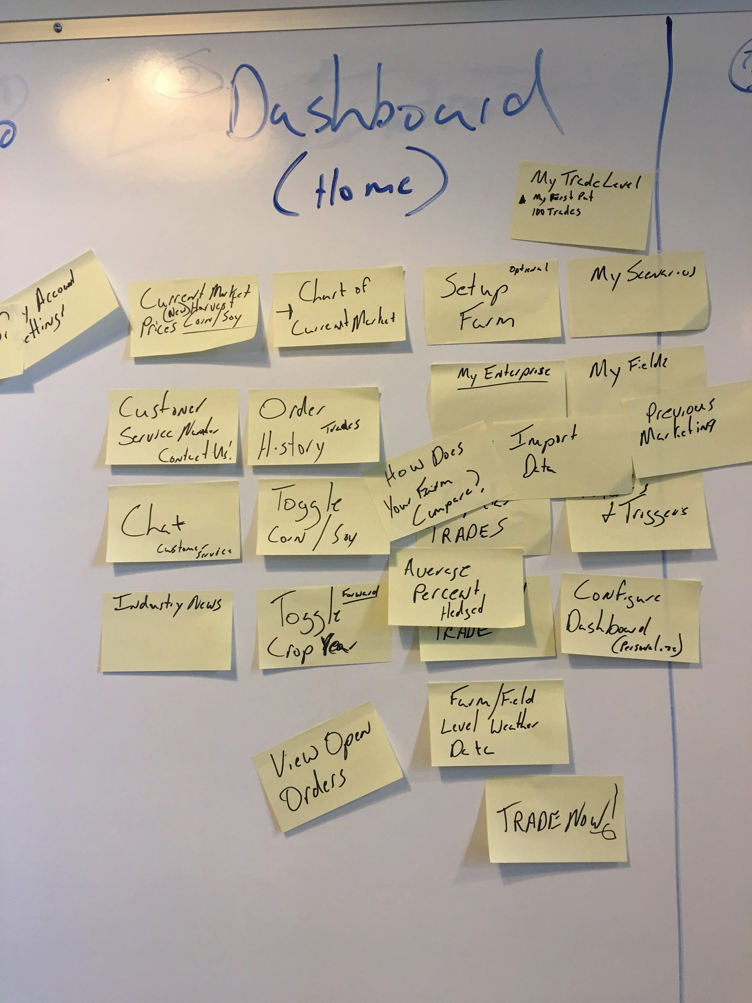
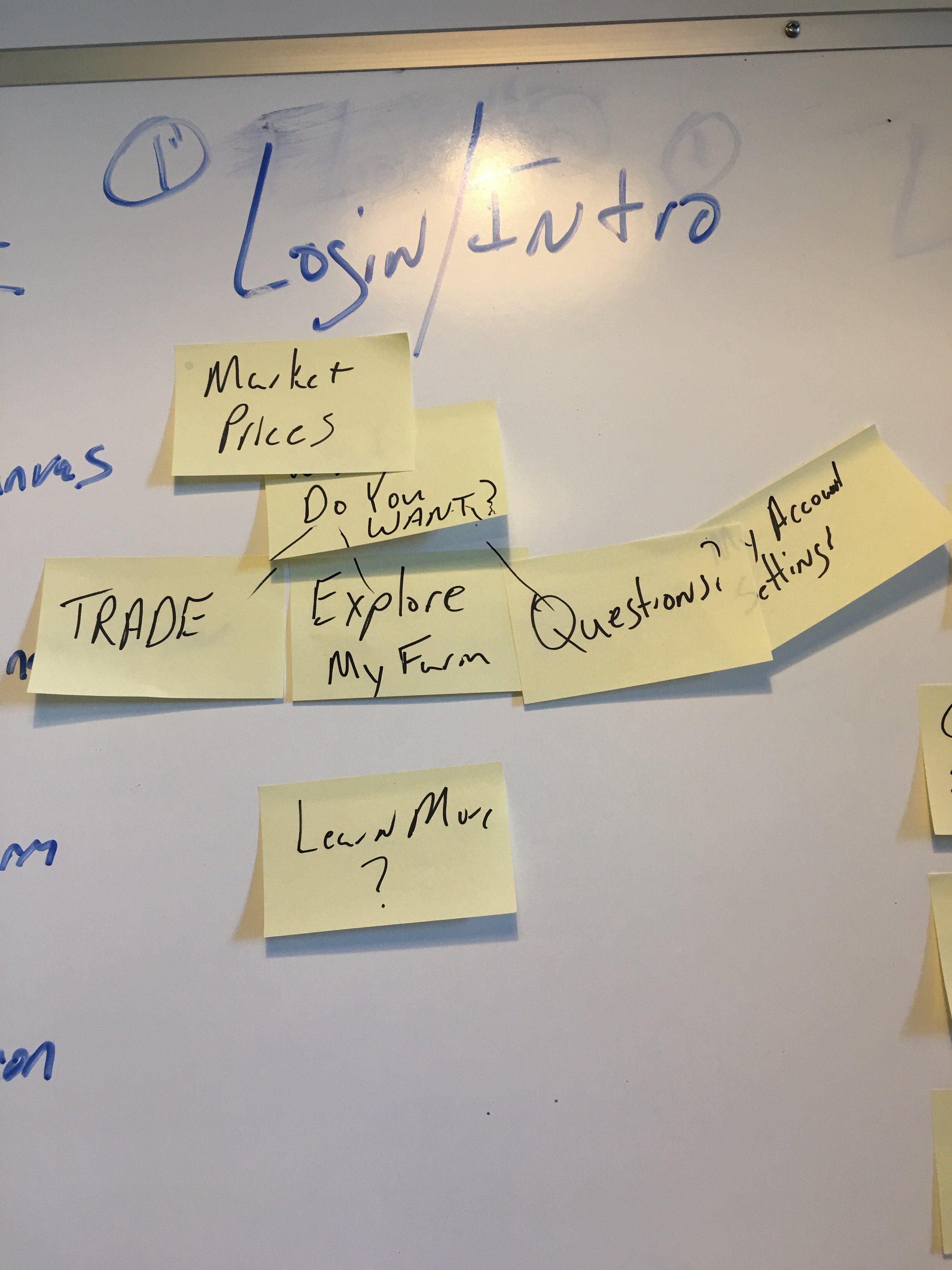
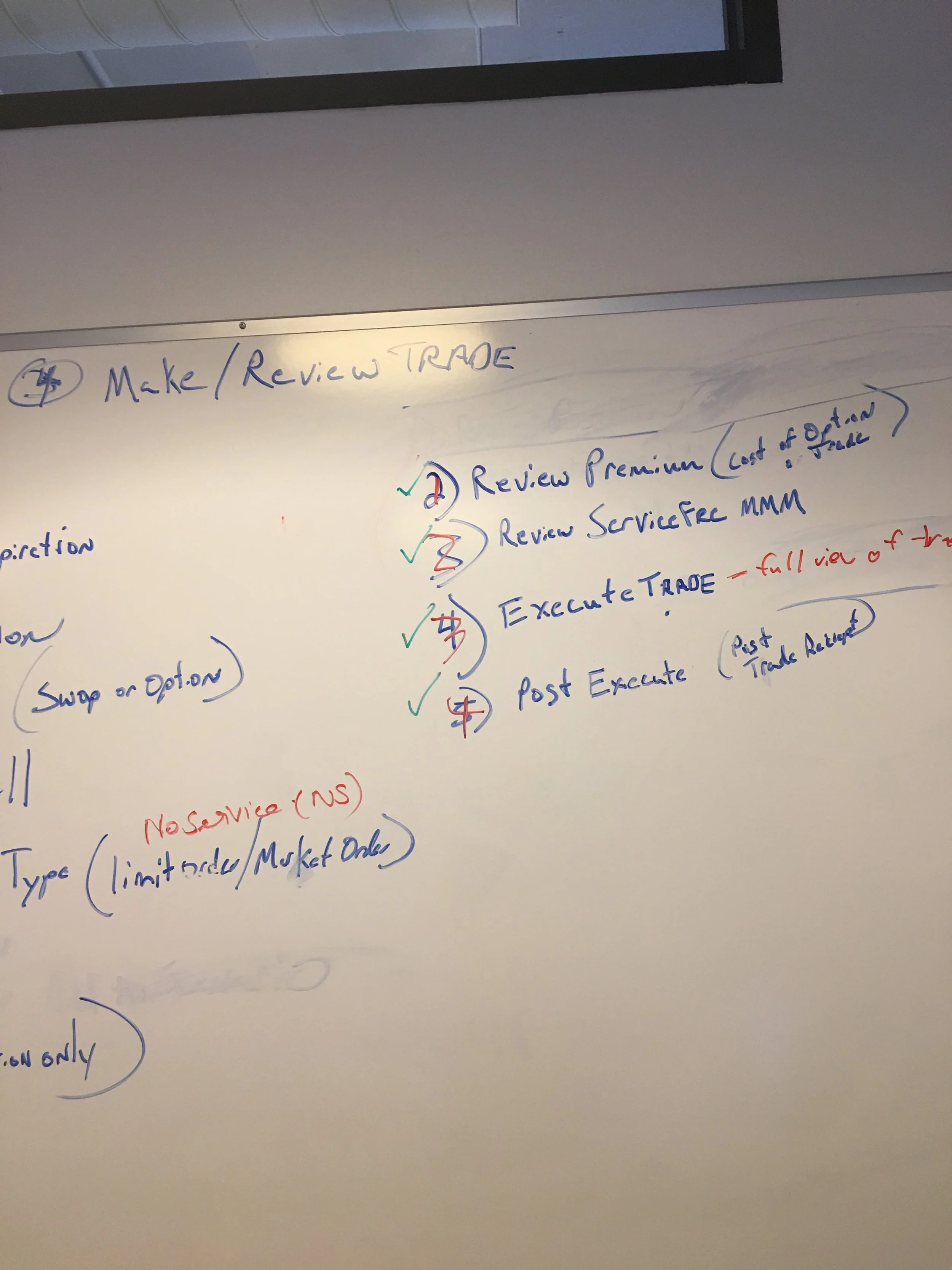
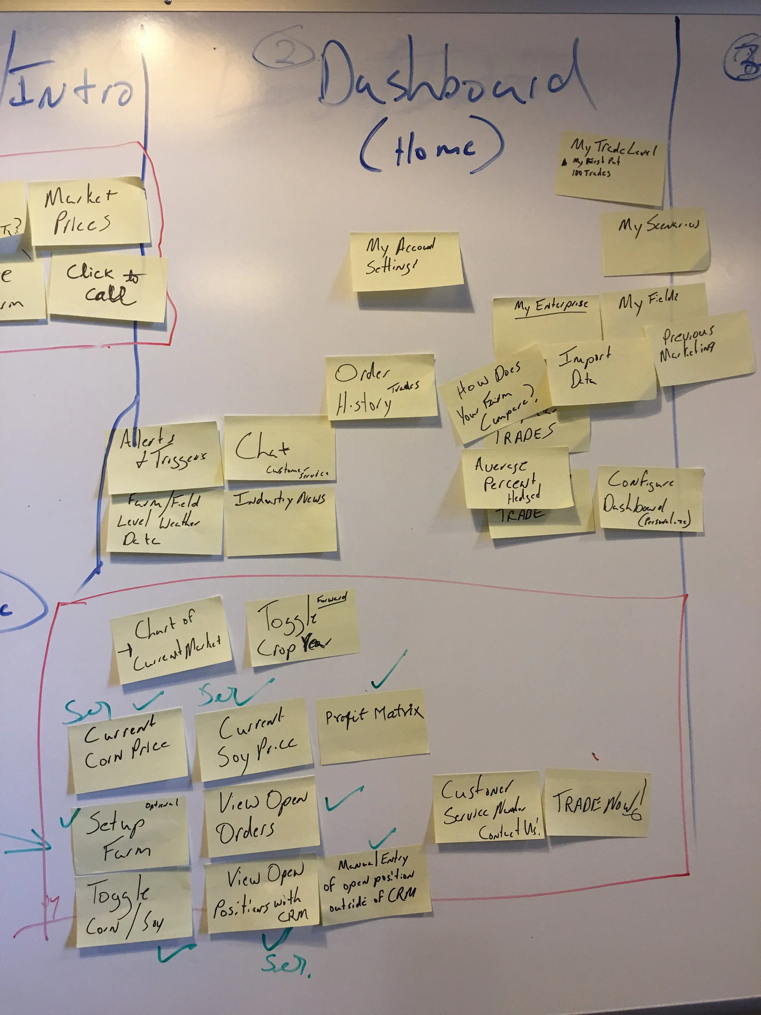
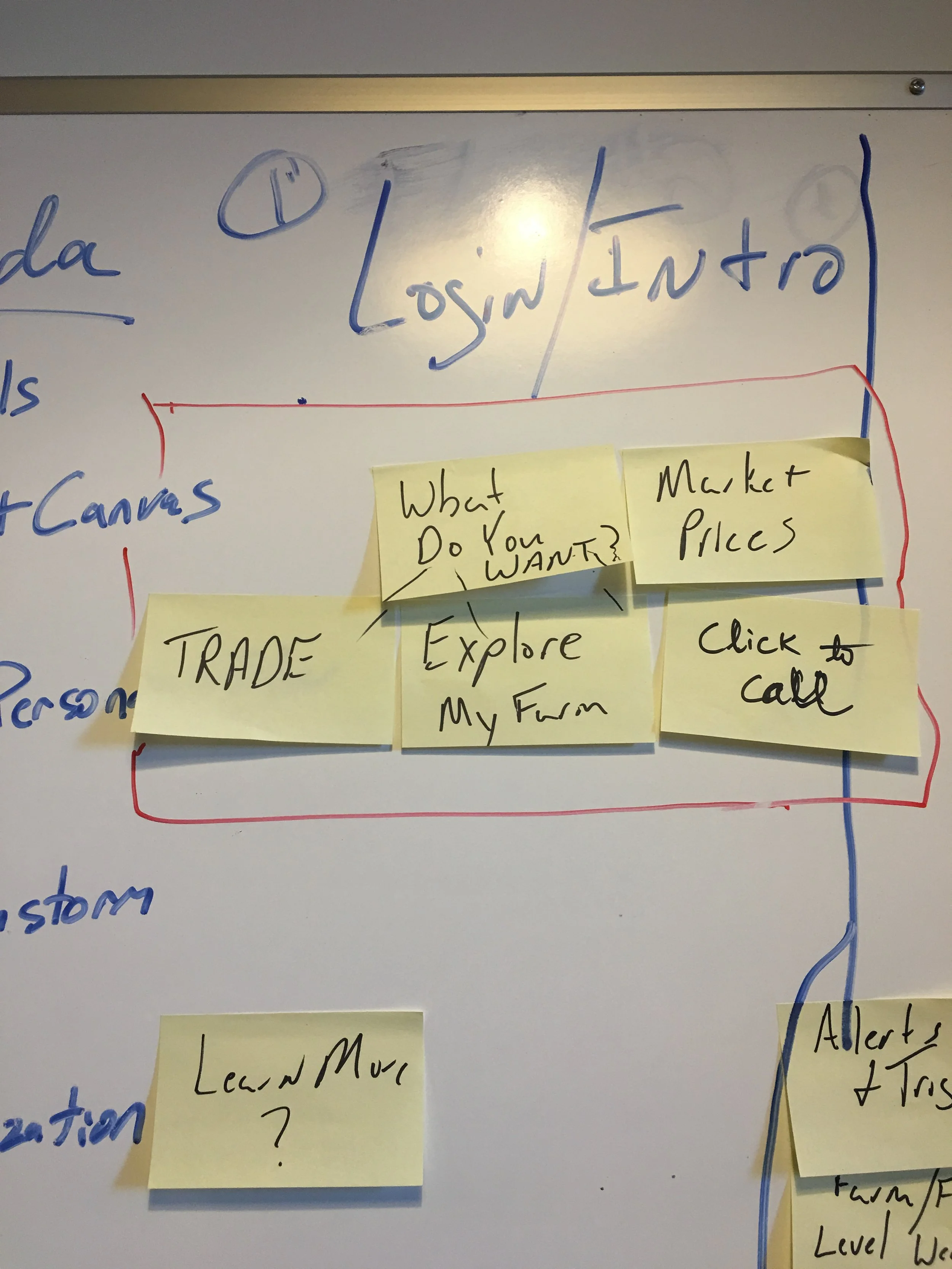
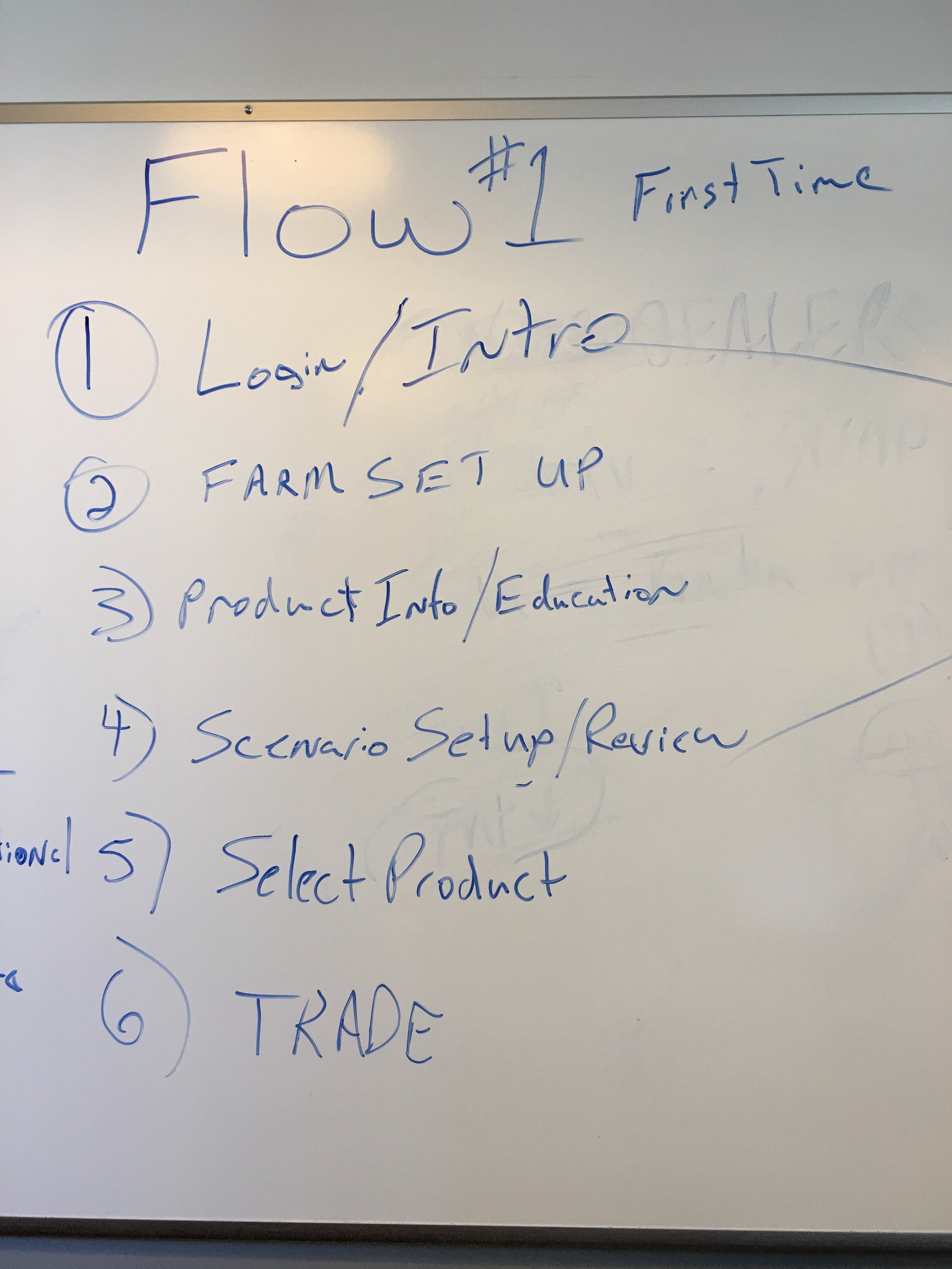
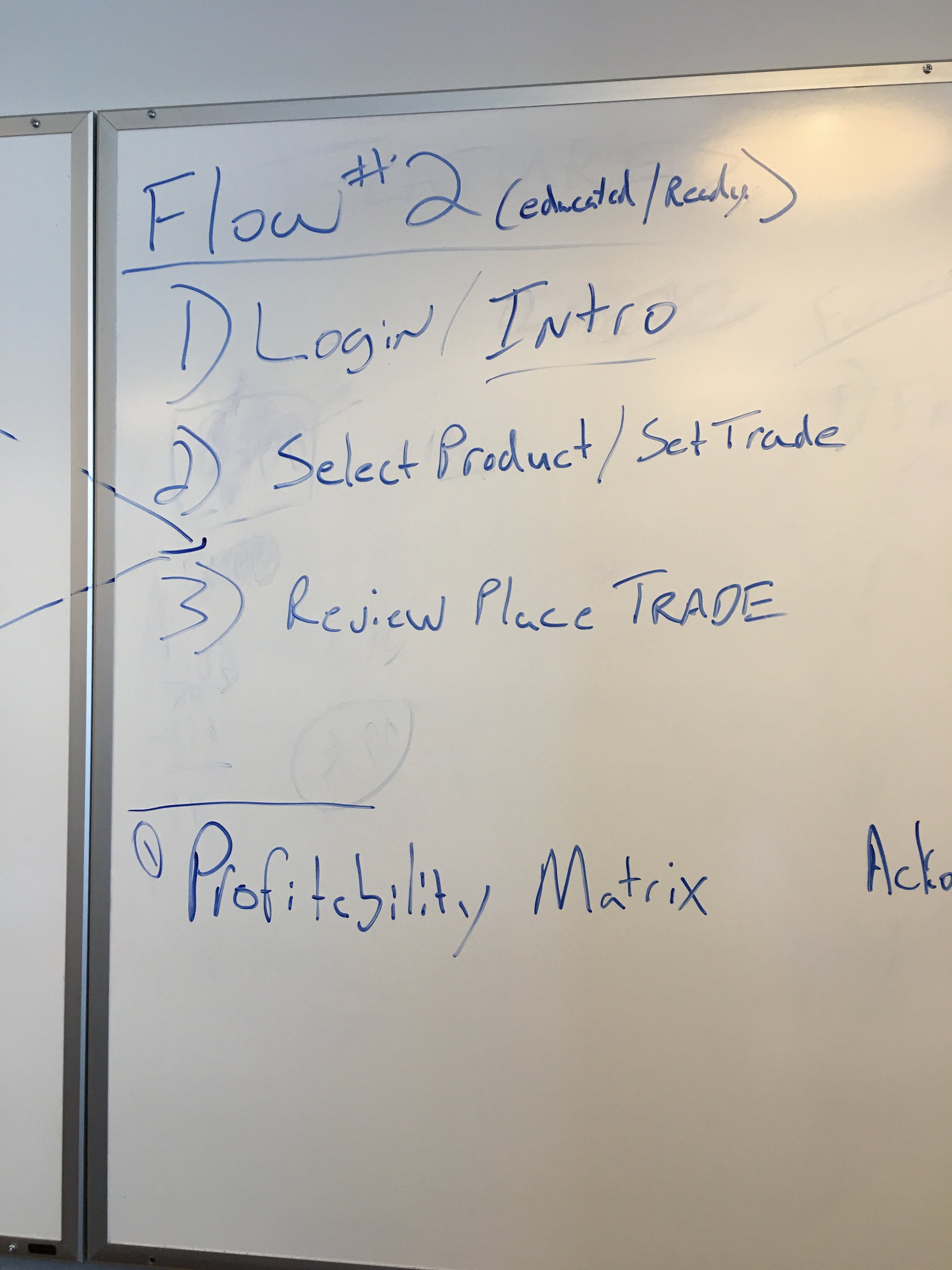
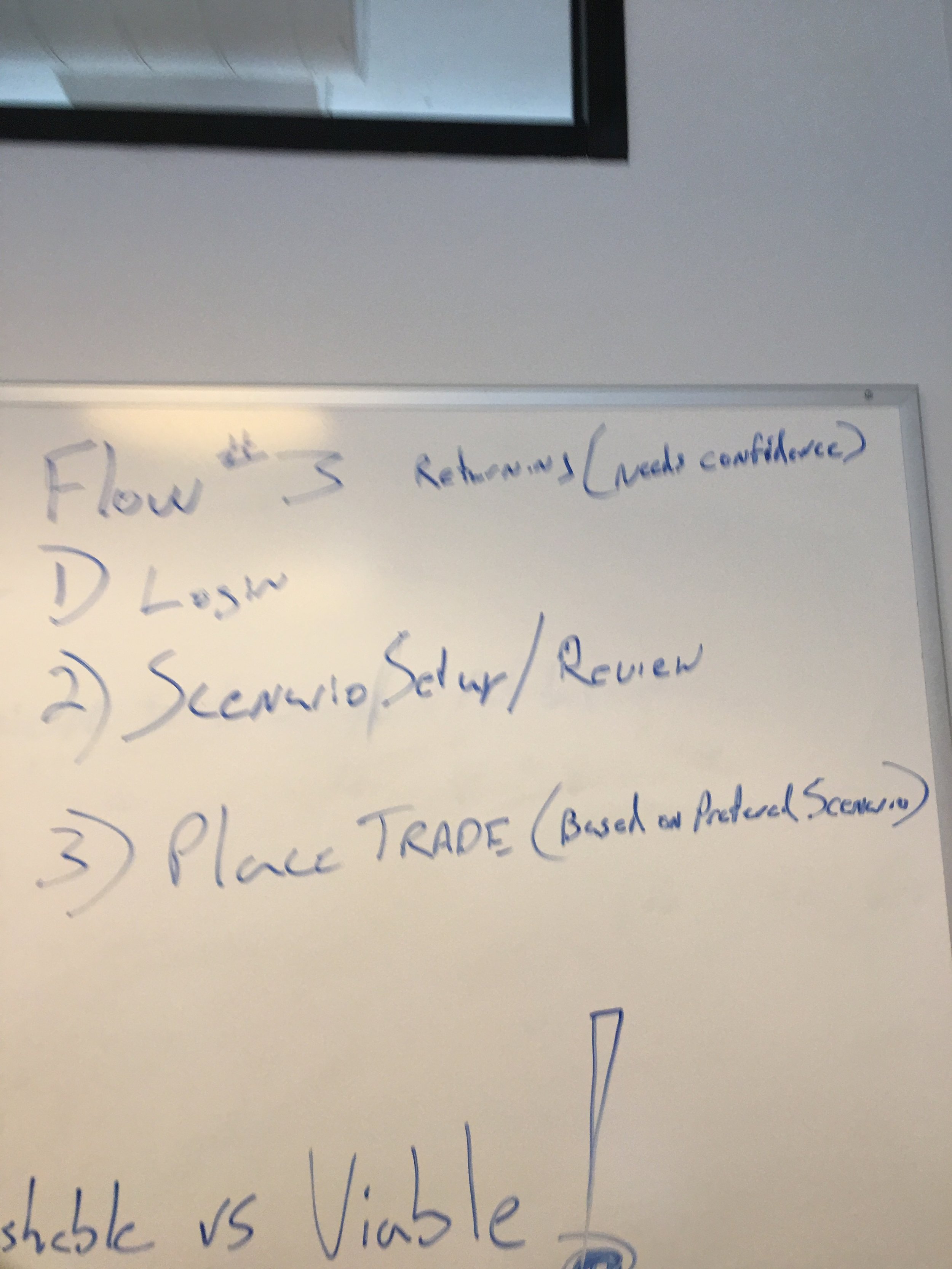
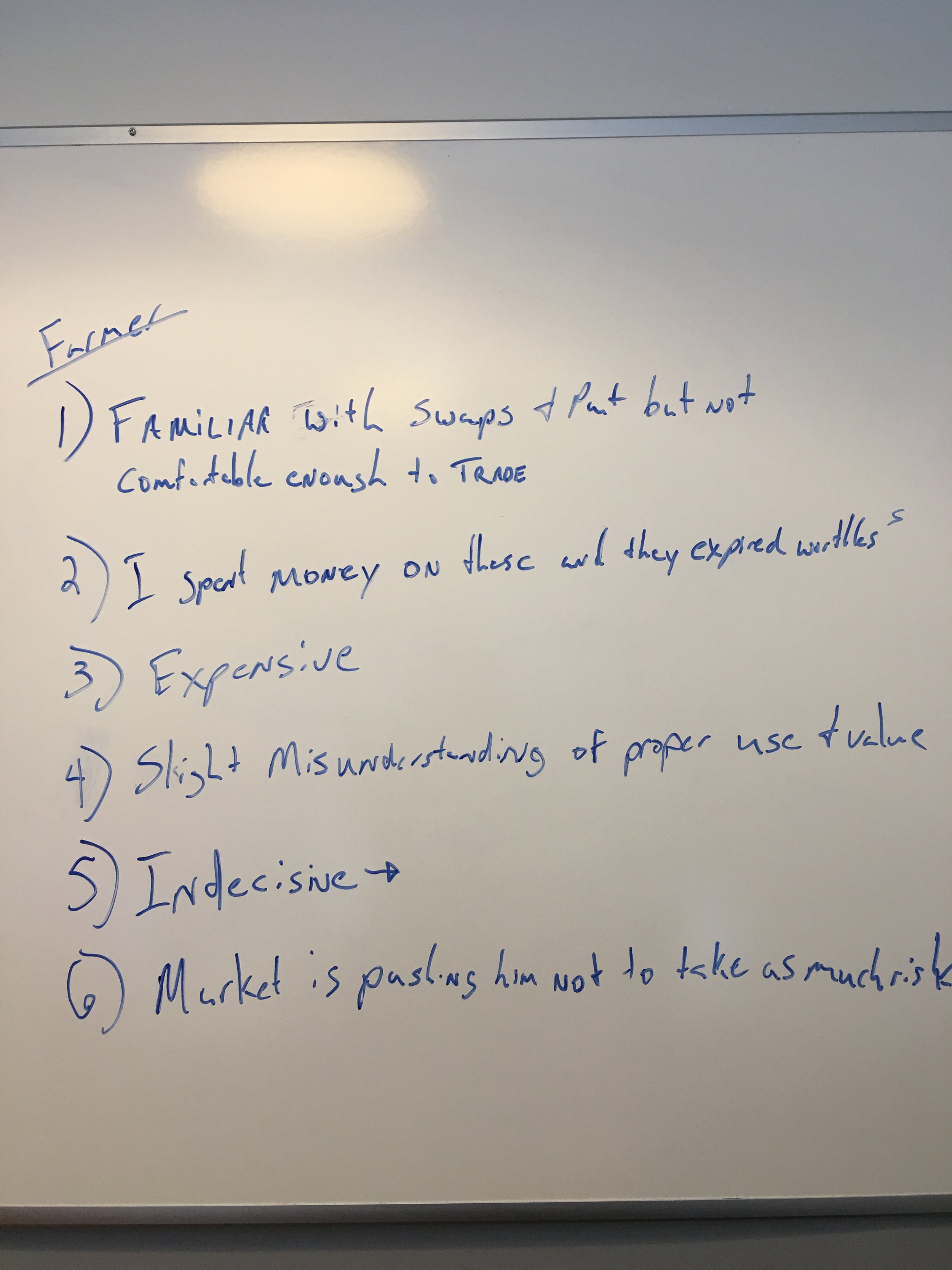
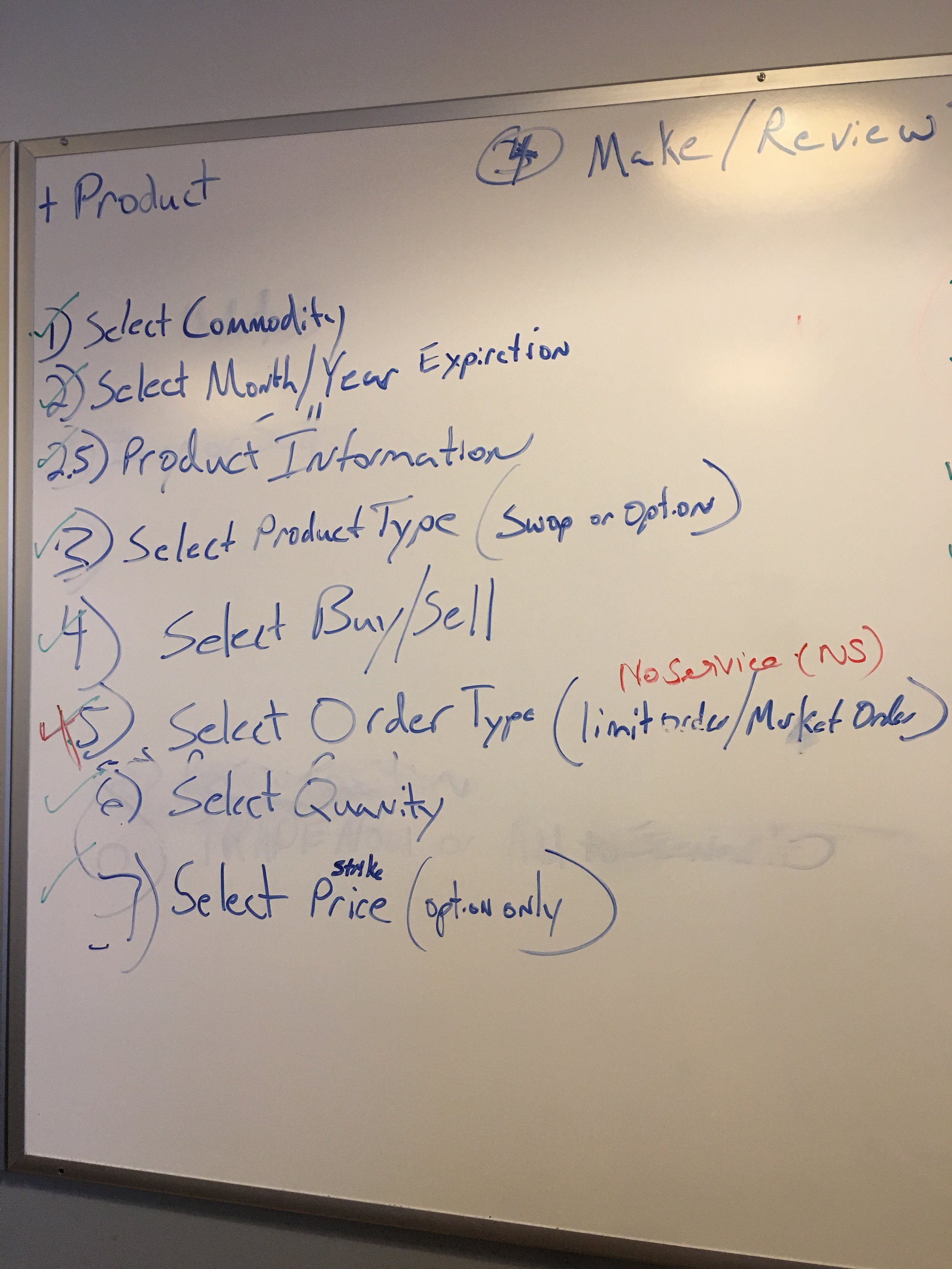
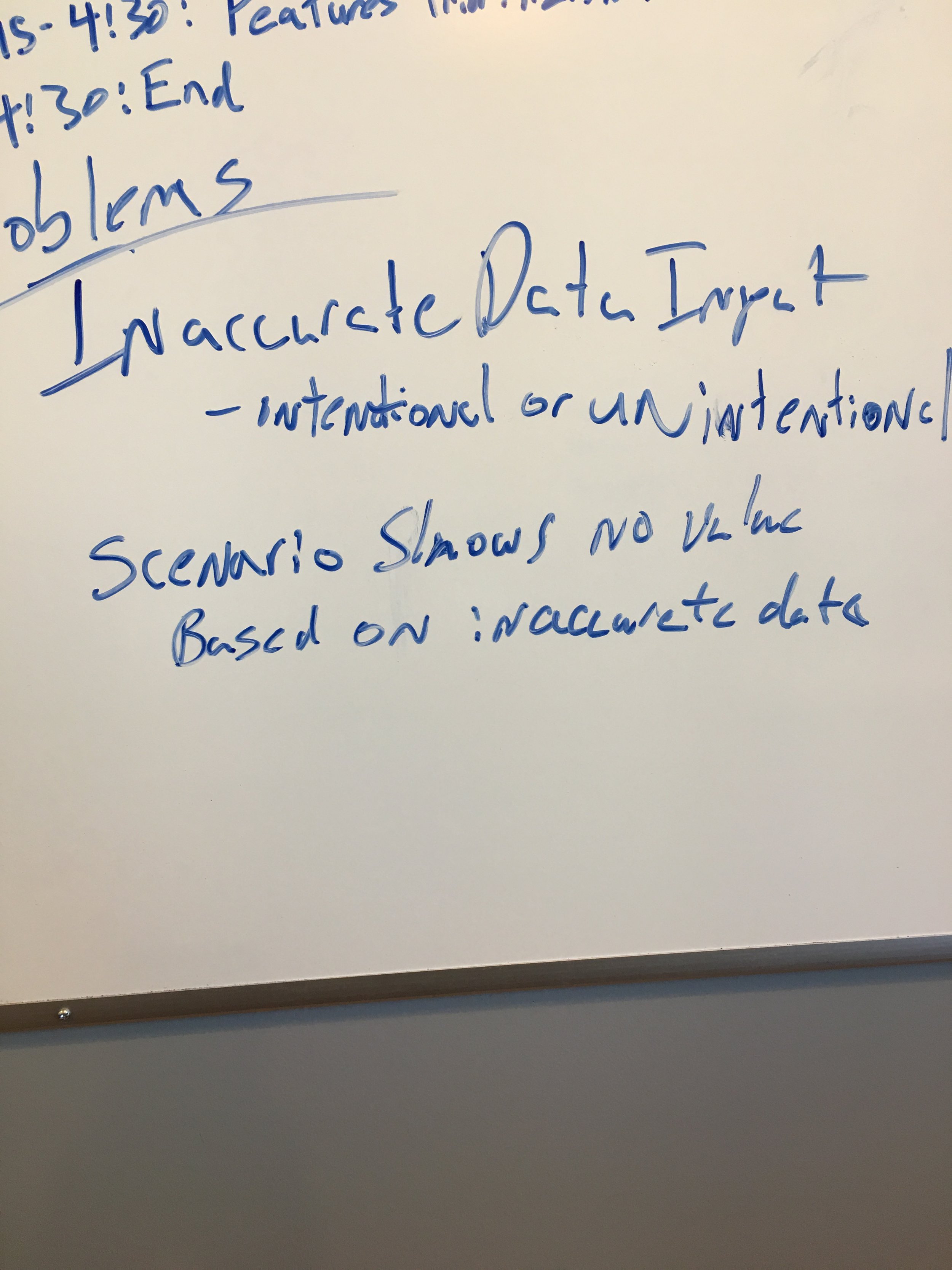
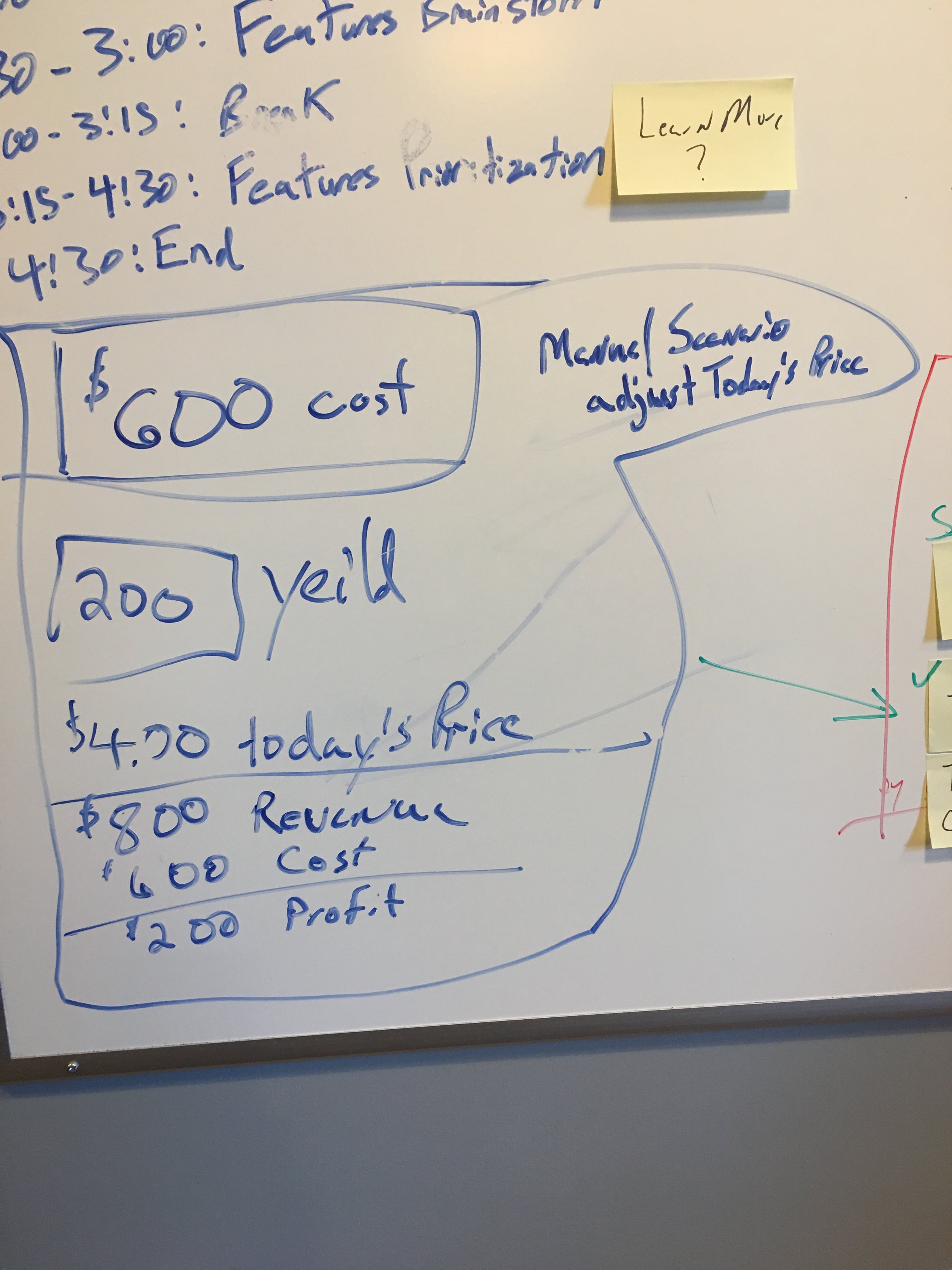
My focus was to ensure we captured our farmers' needs. This was a sticky-note session with farmers, Cargill, and product owners, and it surfaced several key pain points — most farmers were still tracking their operations with pencil and paper, then calling Cargill directly to place commodity trade requests, a process that took at least 60 minutes per call. Cargill wanted to reduce that overhead while giving farmers a single app to manage all their data in one place, and this session was the starting point for aligning on what that solution needed to look like.


What we learned
The sticky-note session validated several assumptions the team had going in, while giving us a clearer, firsthand picture of how deep the pain points actually ran. Hearing directly from farmers confirmed that manual, pencil-and-paper tracking wasn't just an inconvenience — it was a daily bottleneck that made it harder for them to act quickly on trade decisions. Similarly, the 60+ minute phone calls to Cargill weren't an occasional friction point; they were a routine part of doing business, and farmers were eager for a faster alternative.
This alignment between what we expected and what we heard gave the team confidence to move forward with a unified app experience, rather than second-guessing the core problem we were solving. It also reinforced that any solution needed to address two things at once: reducing Cargill's operational overhead and giving farmers a single, reliable place to manage their data.
Screen Flows and Wireframes
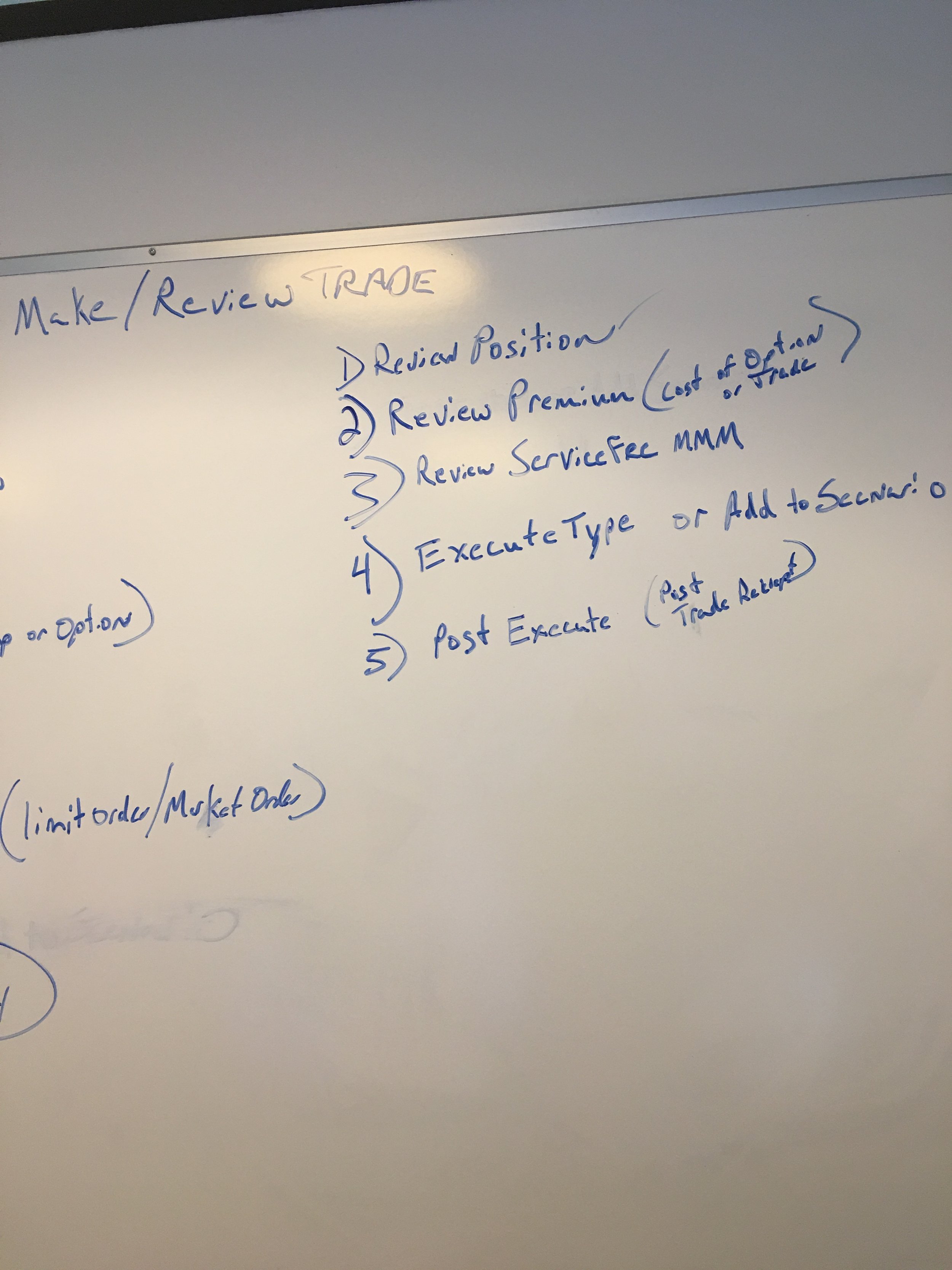
Close collaboration with stakeholders to ensure alignment with business goals was necessary to create wireframes with an iterative approach. This involved hands-on prototyping using InVision and Principle, where I built interactive prototypes to test my design hypotheses and validate user needs through usability studies.


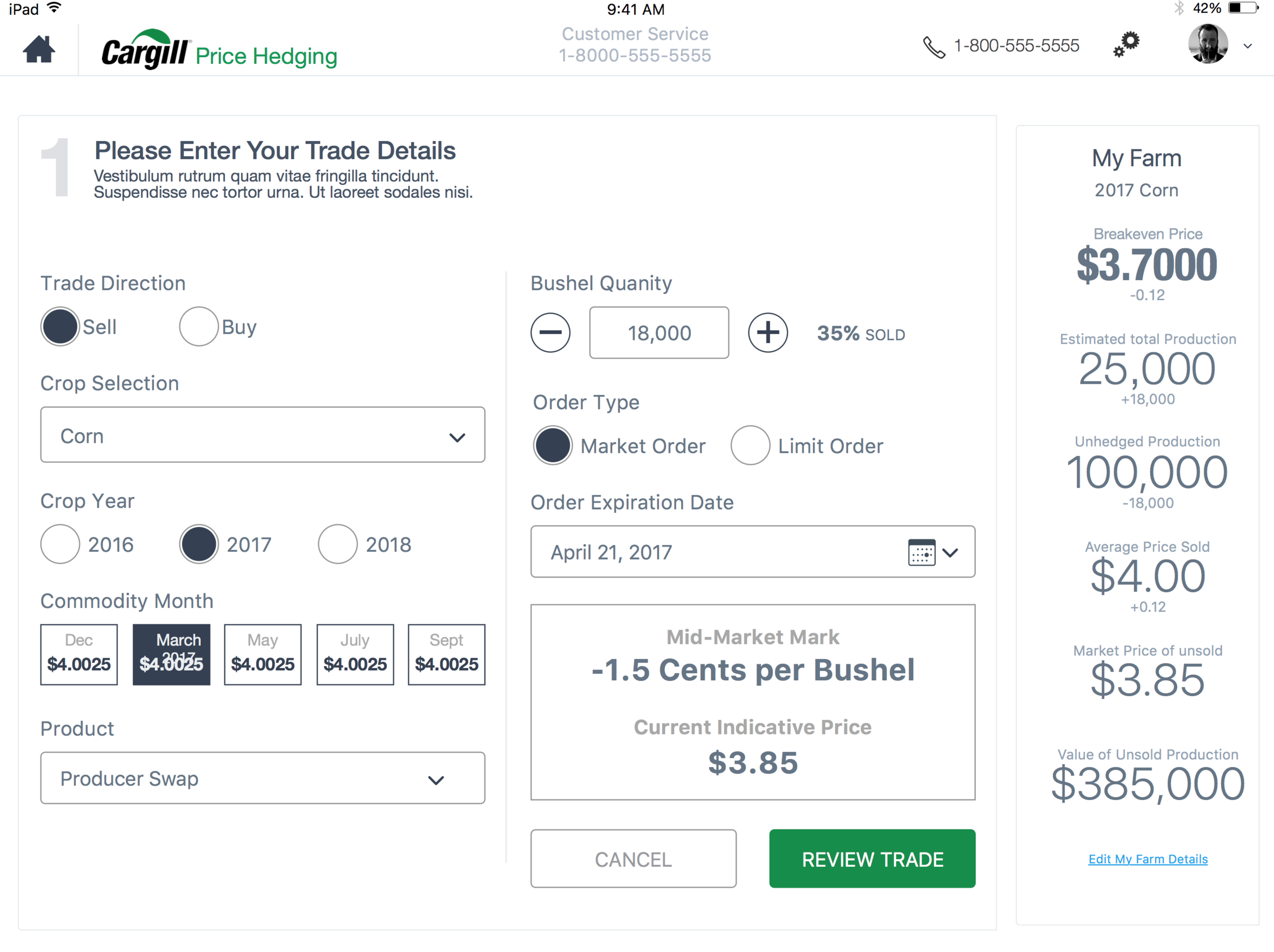
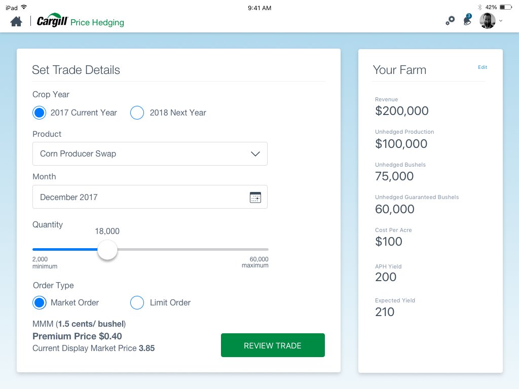
Final Design
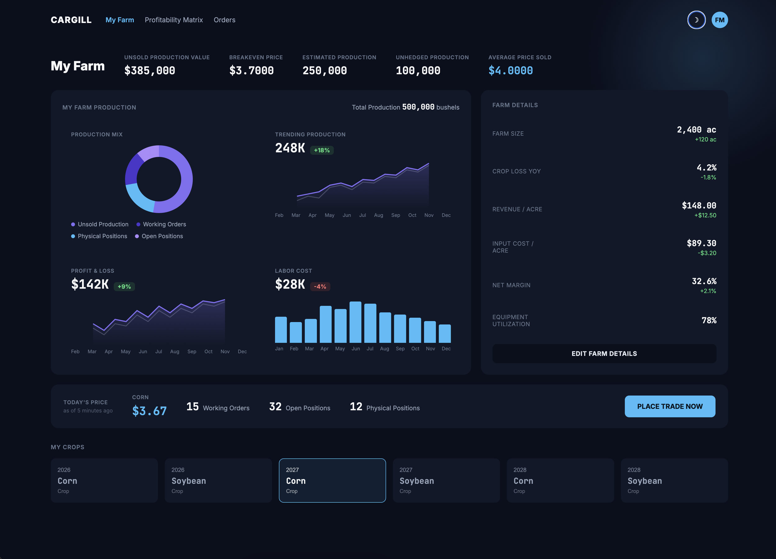
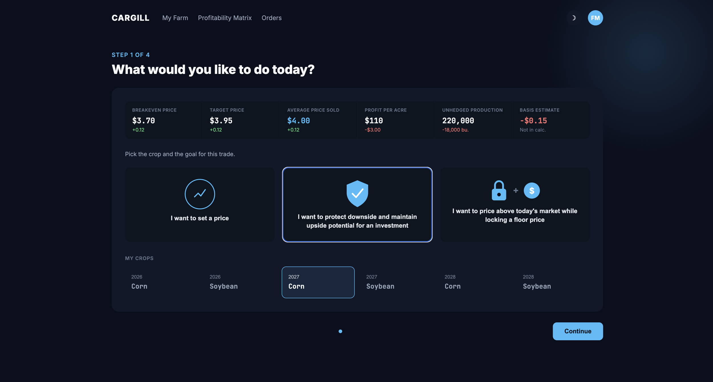
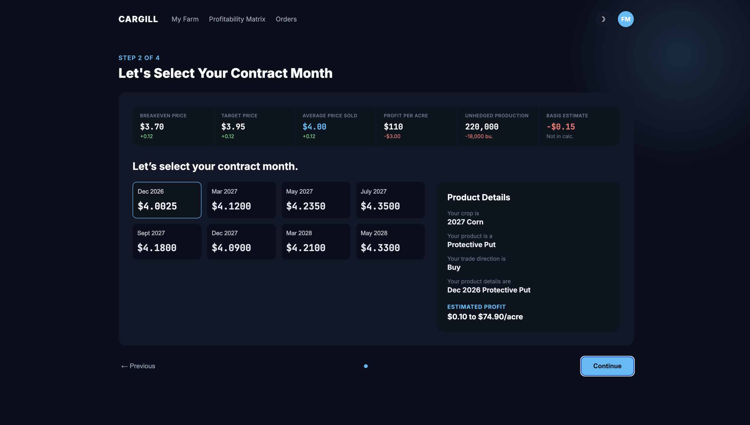
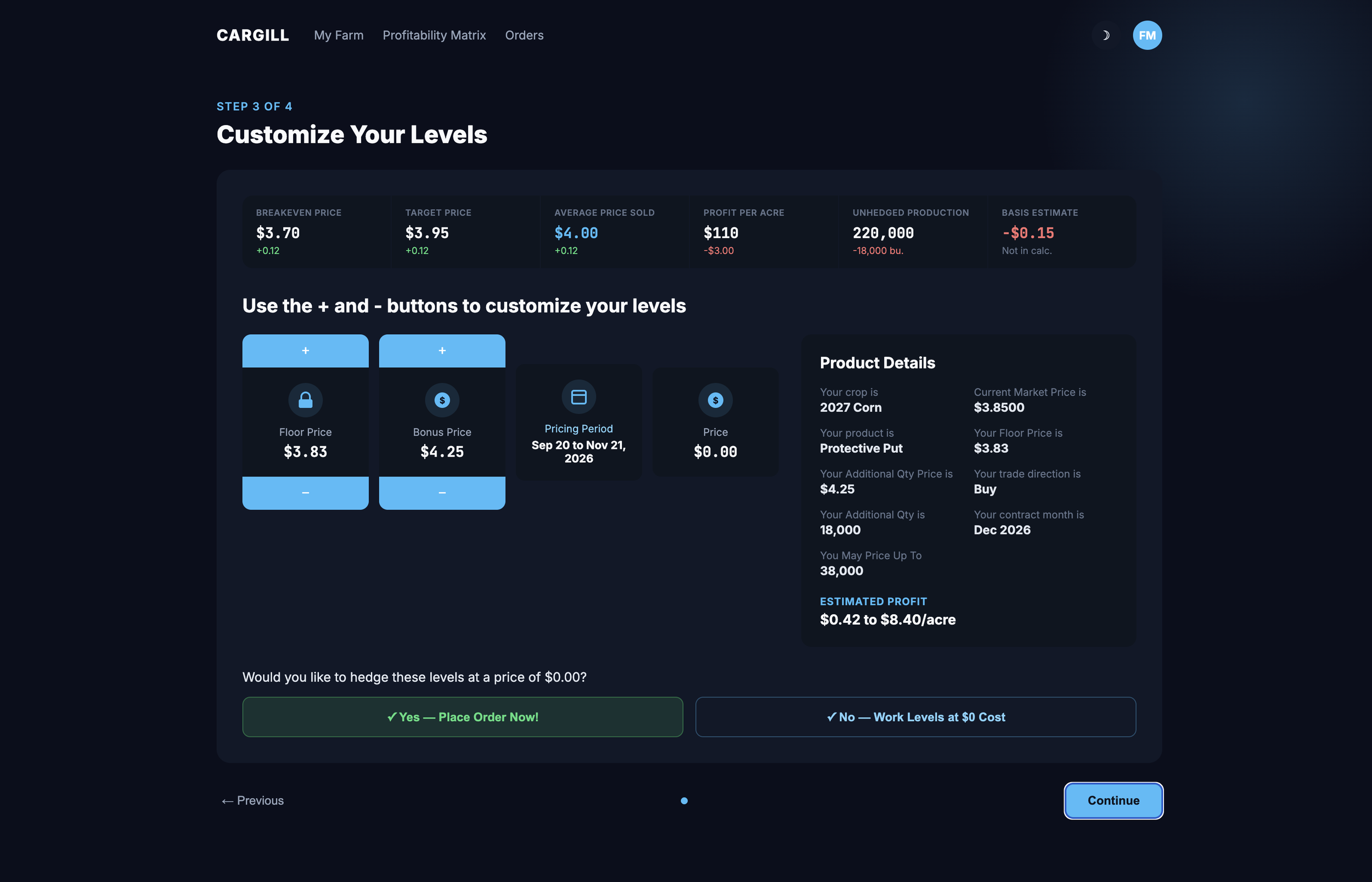
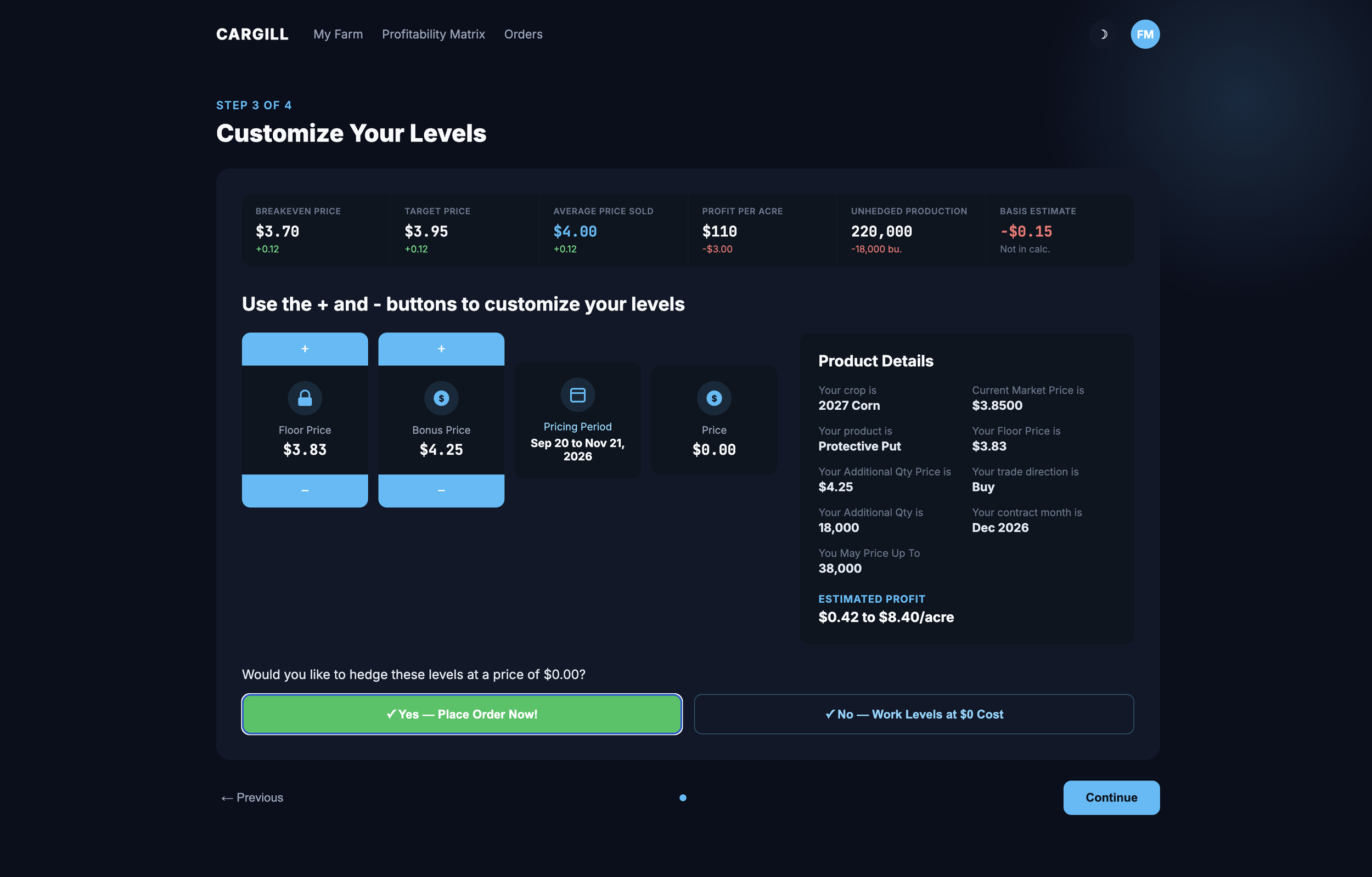
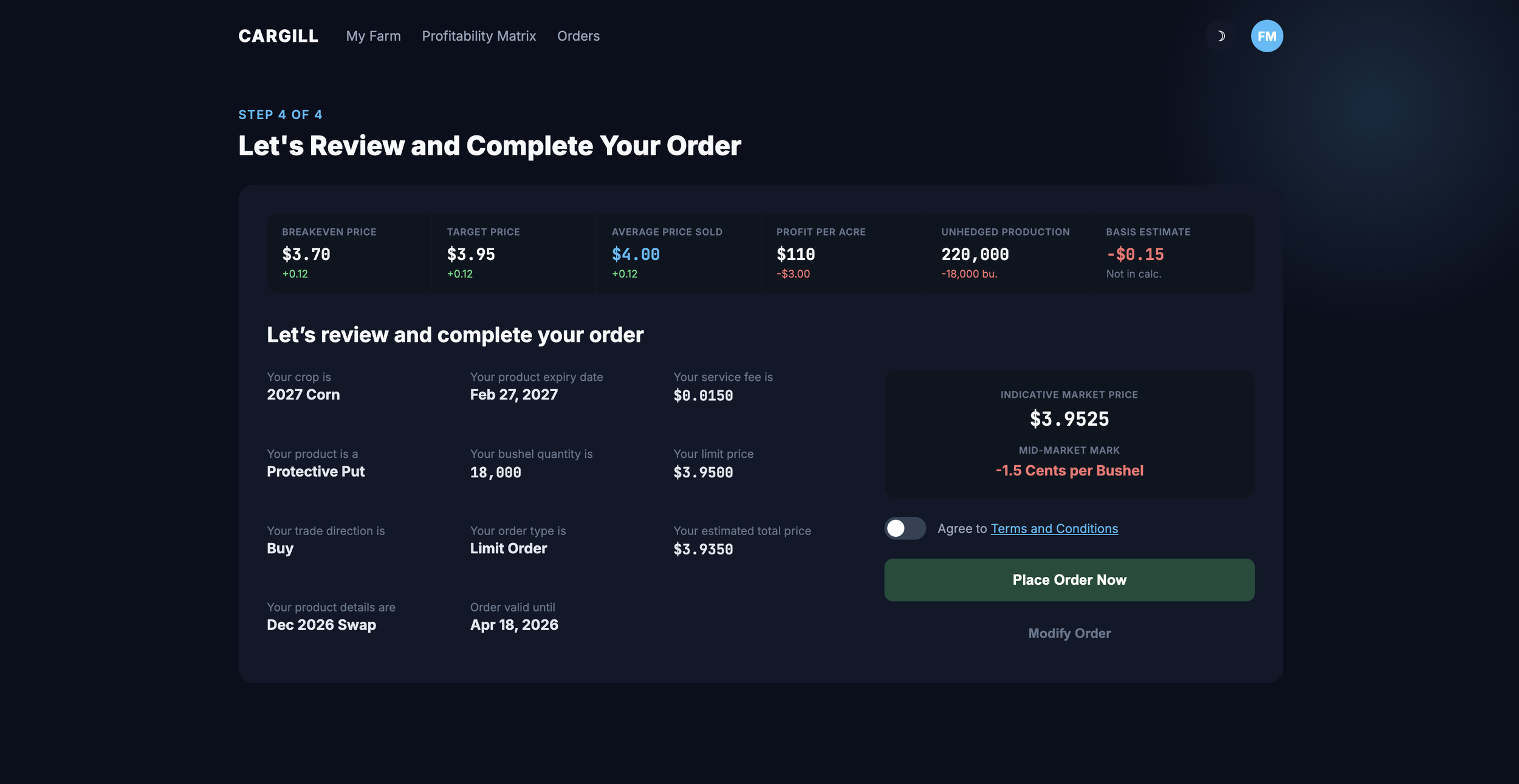
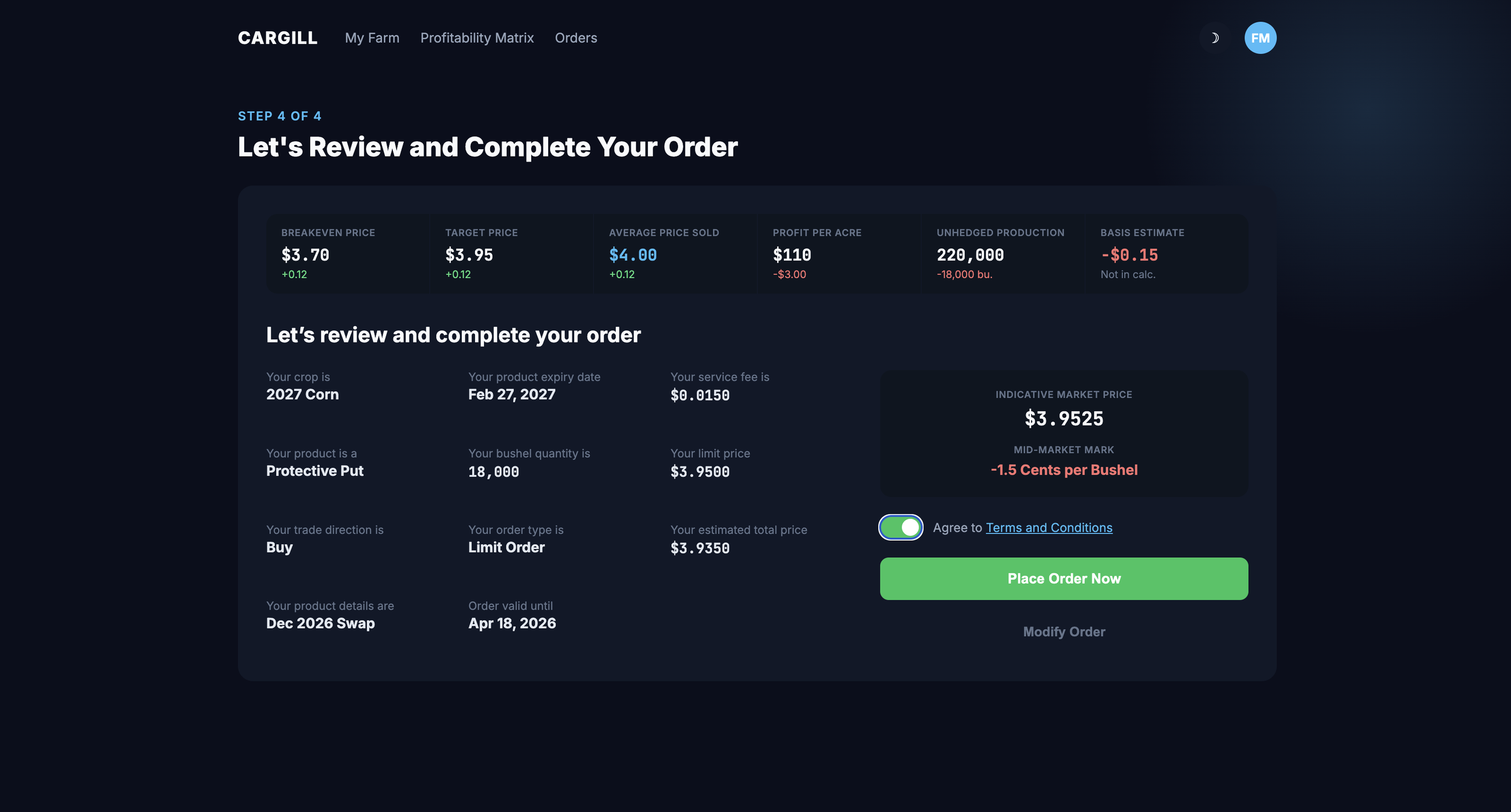
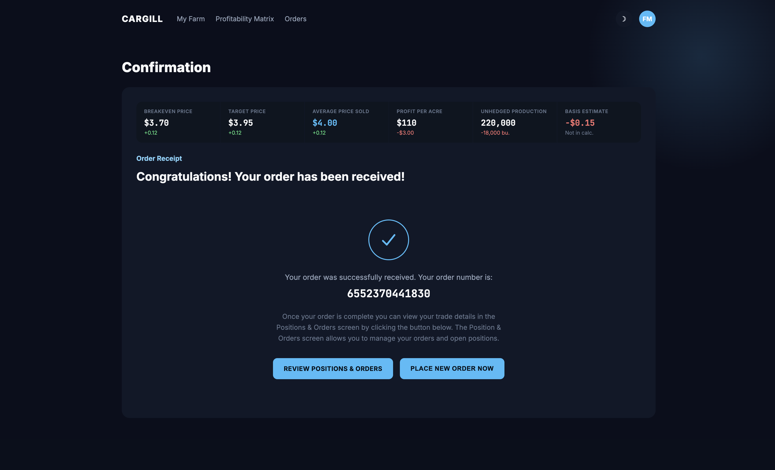
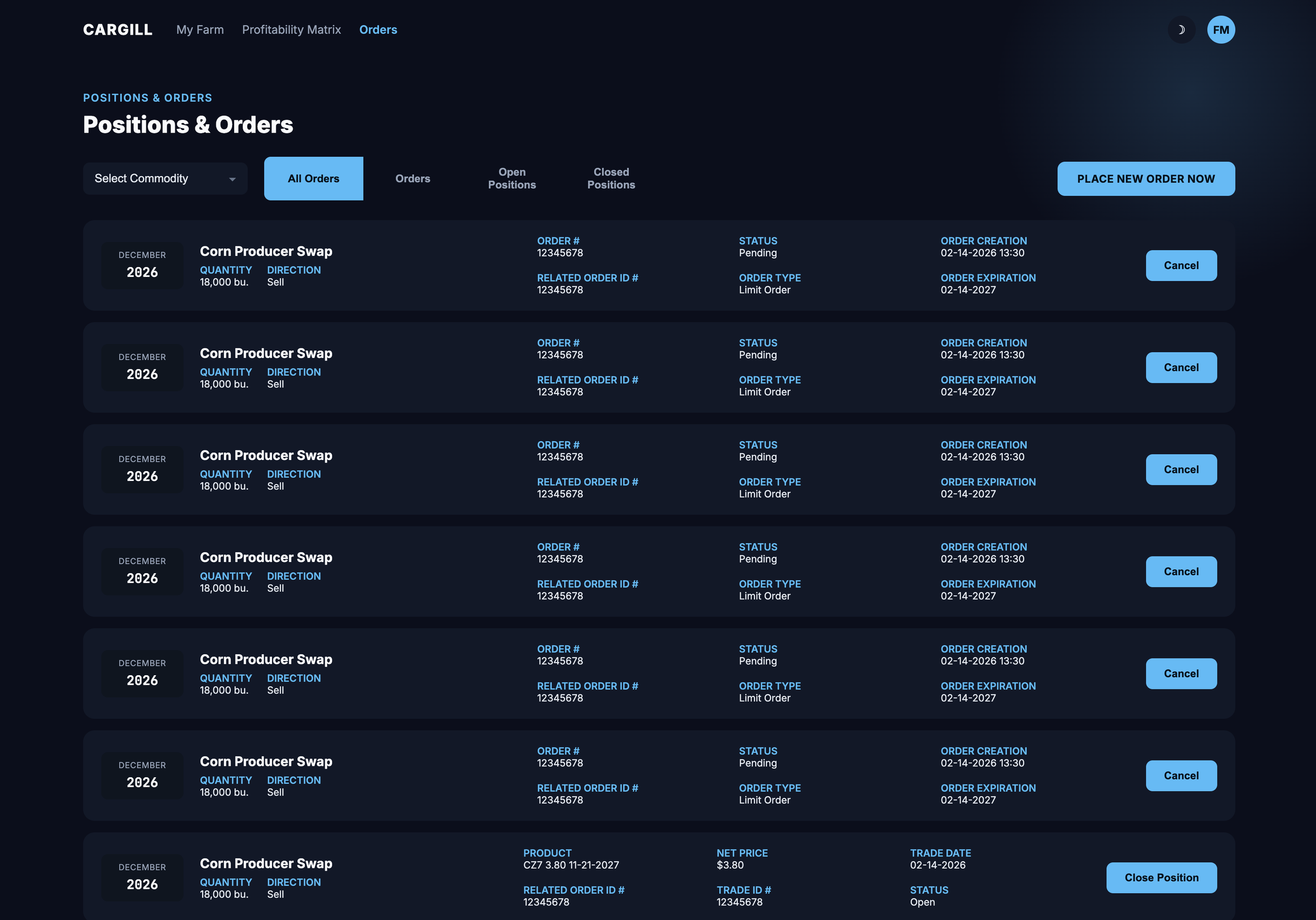
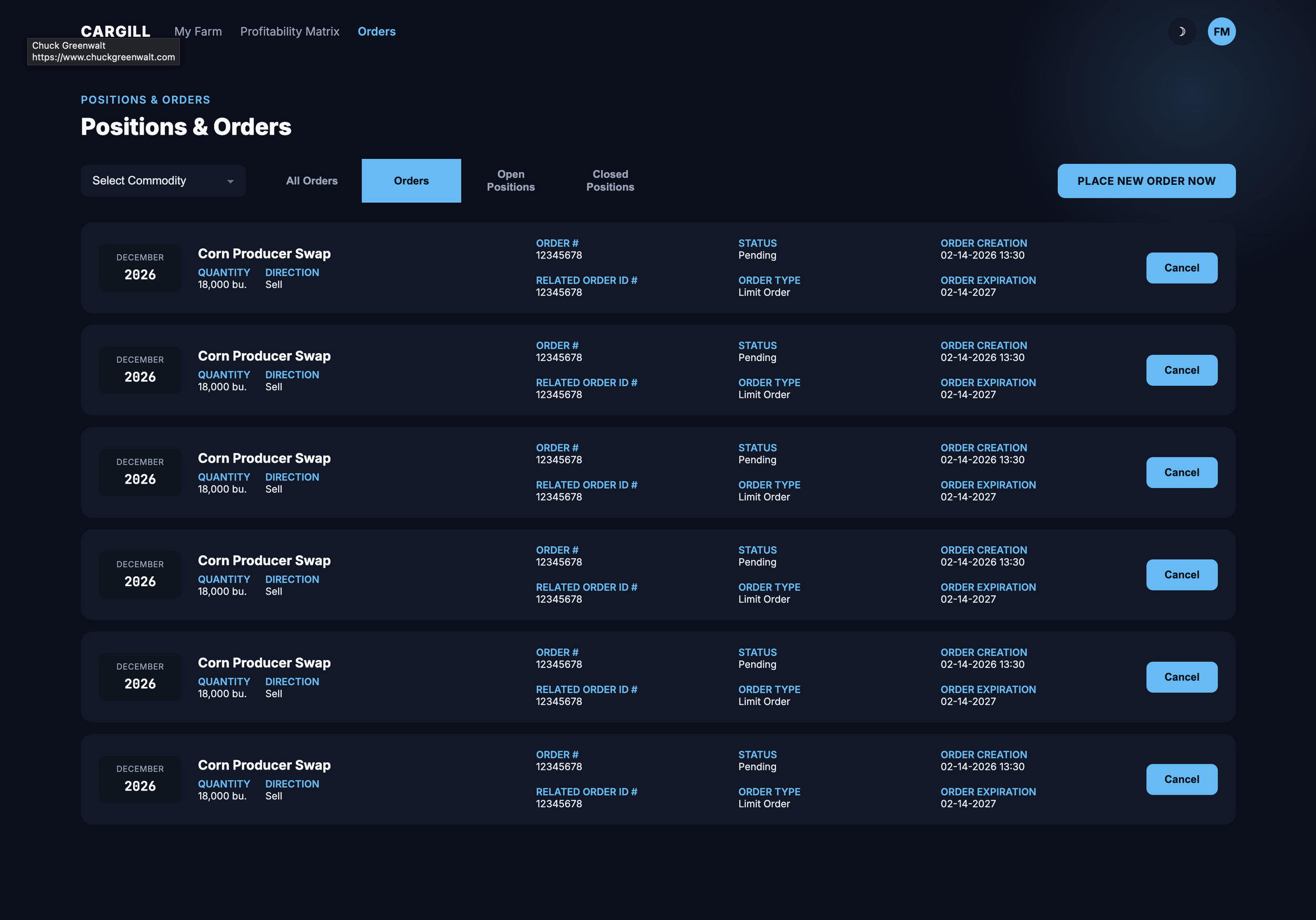
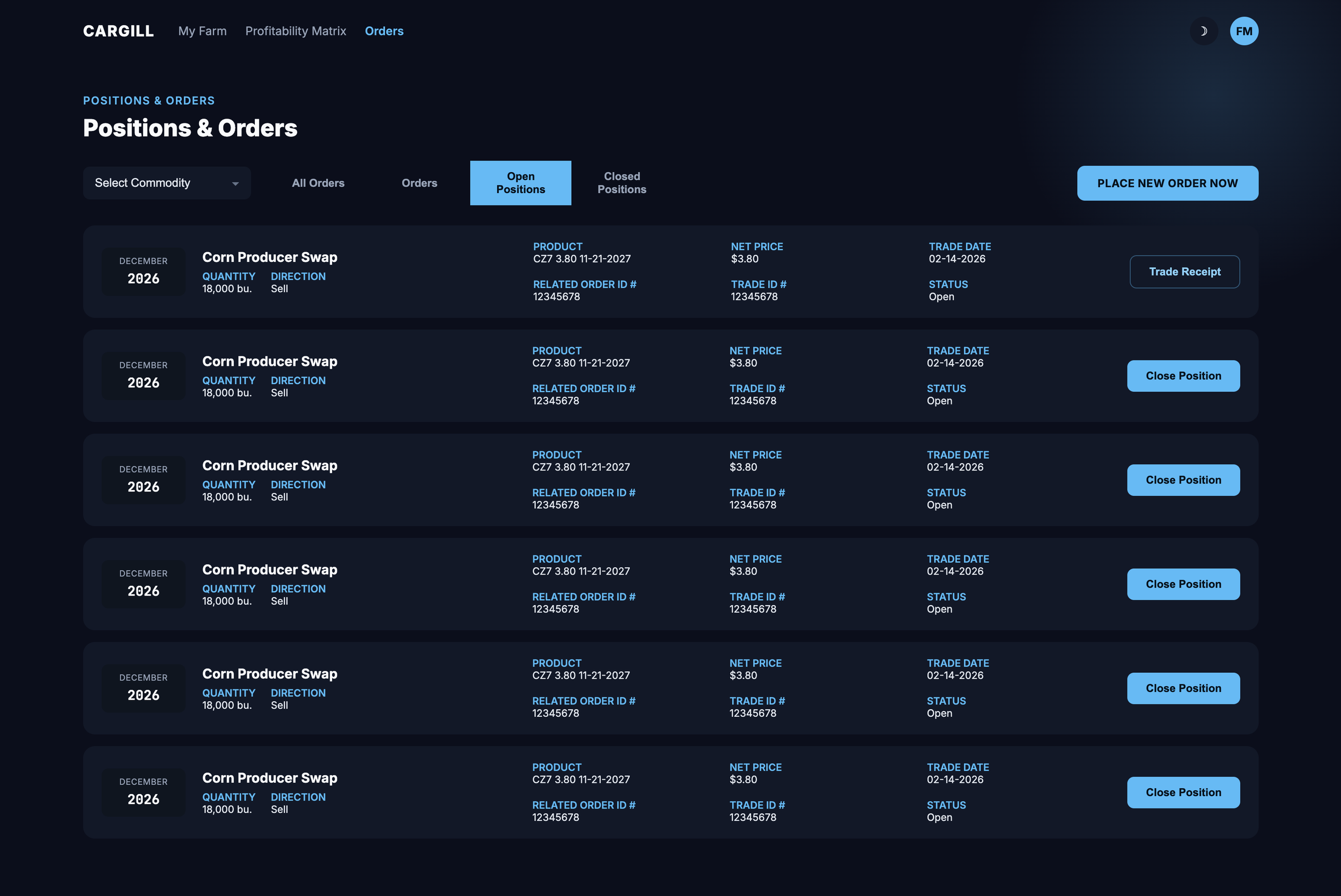
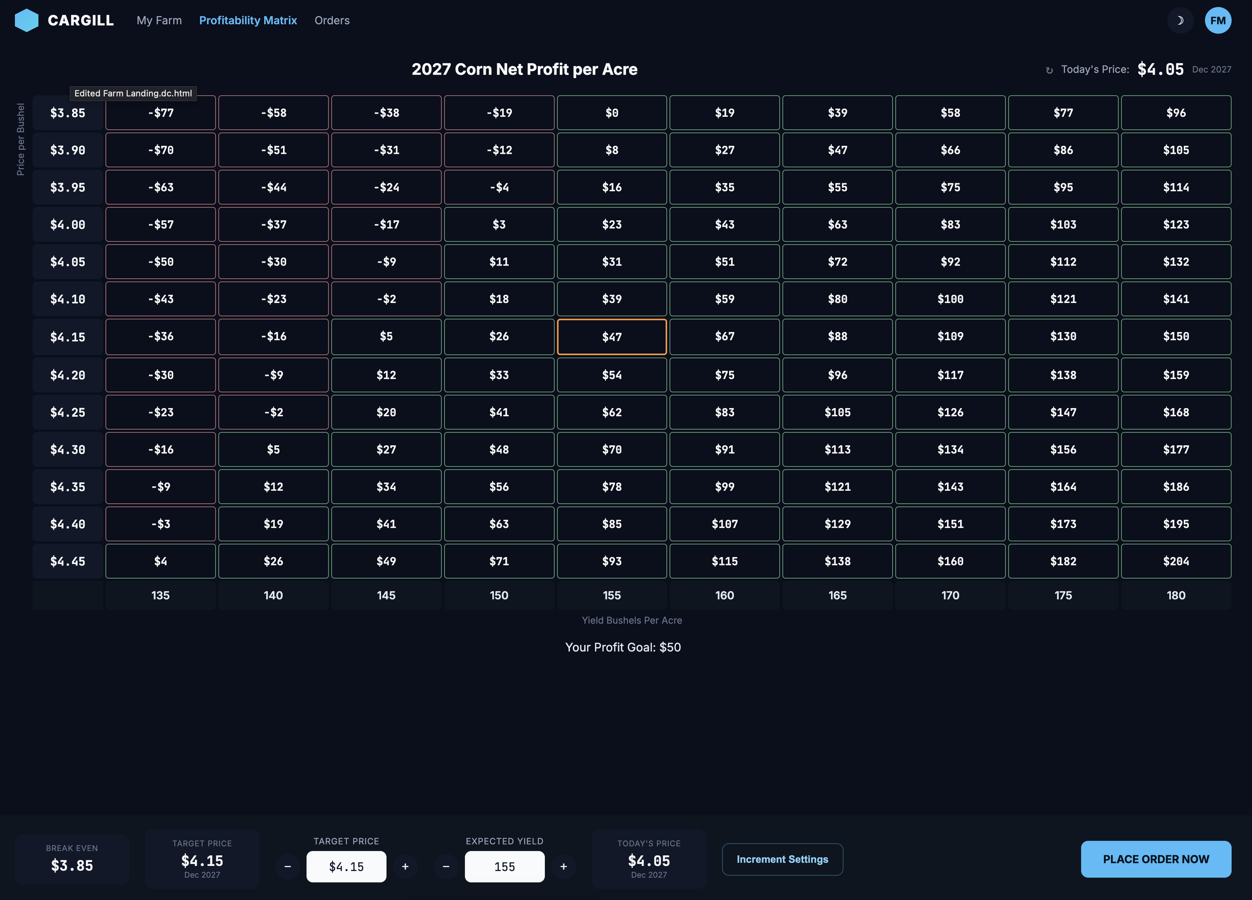
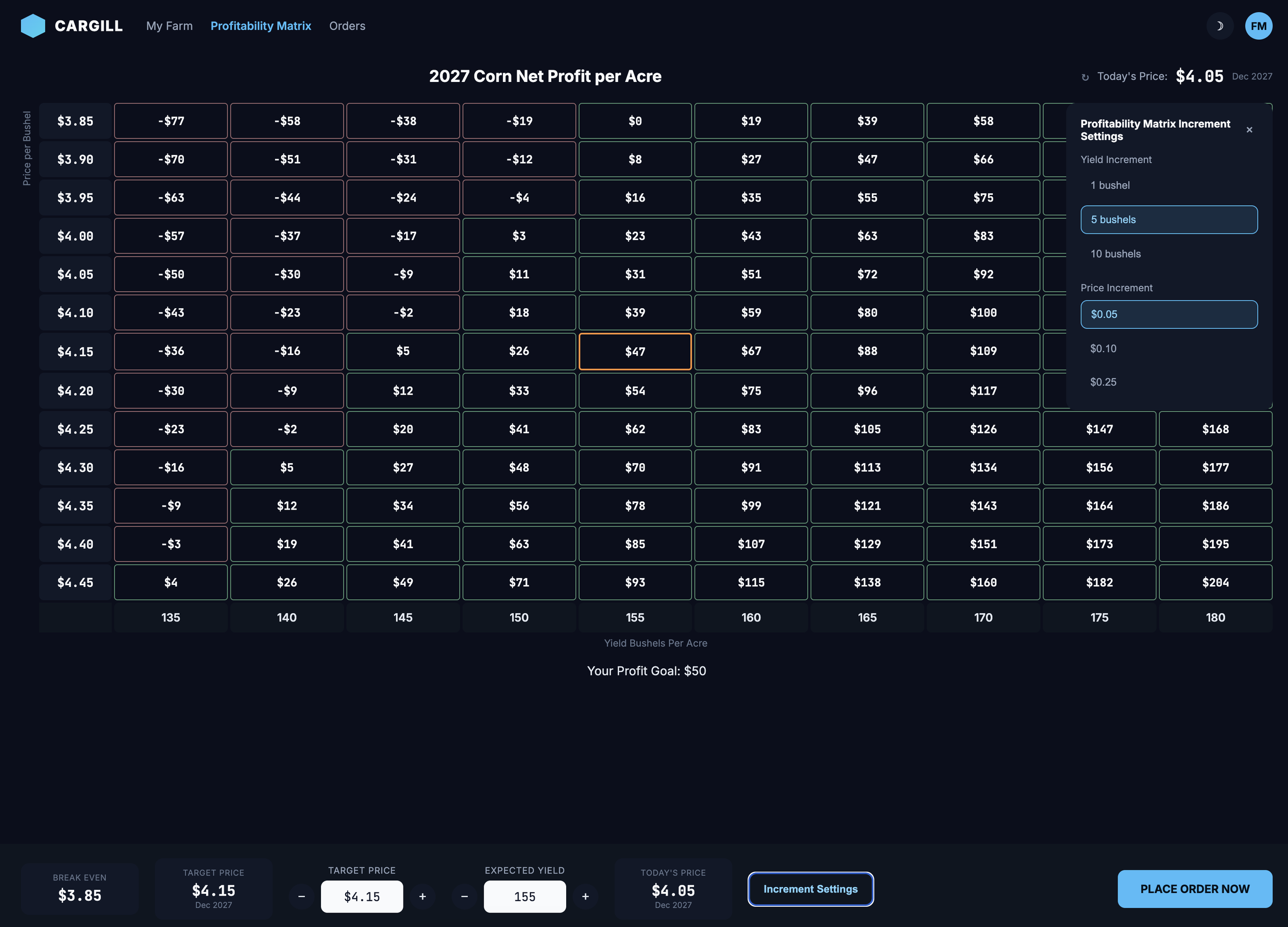
I worked closely with the Cargill Branding Team in crafting the visual design language of the commodity app, ensuring it aligned with Cargill’s branding guidelines while prioritizing usability for farmers in real-world conditions.
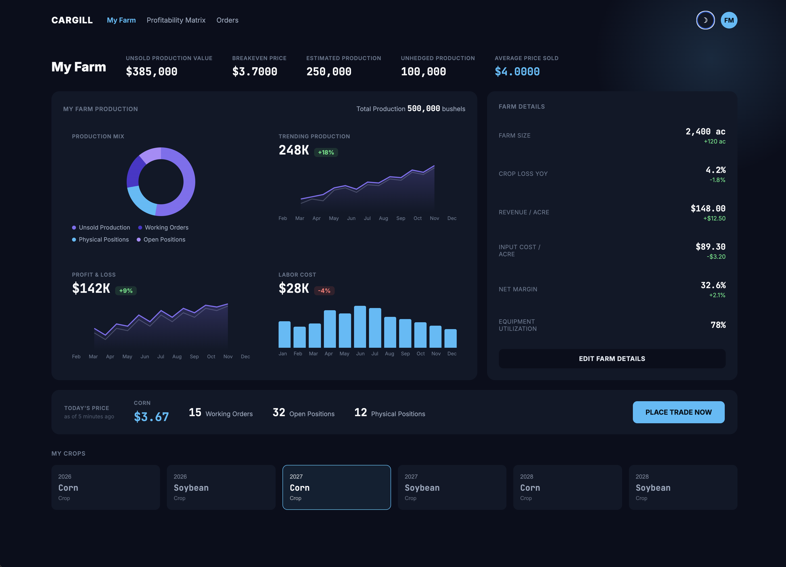
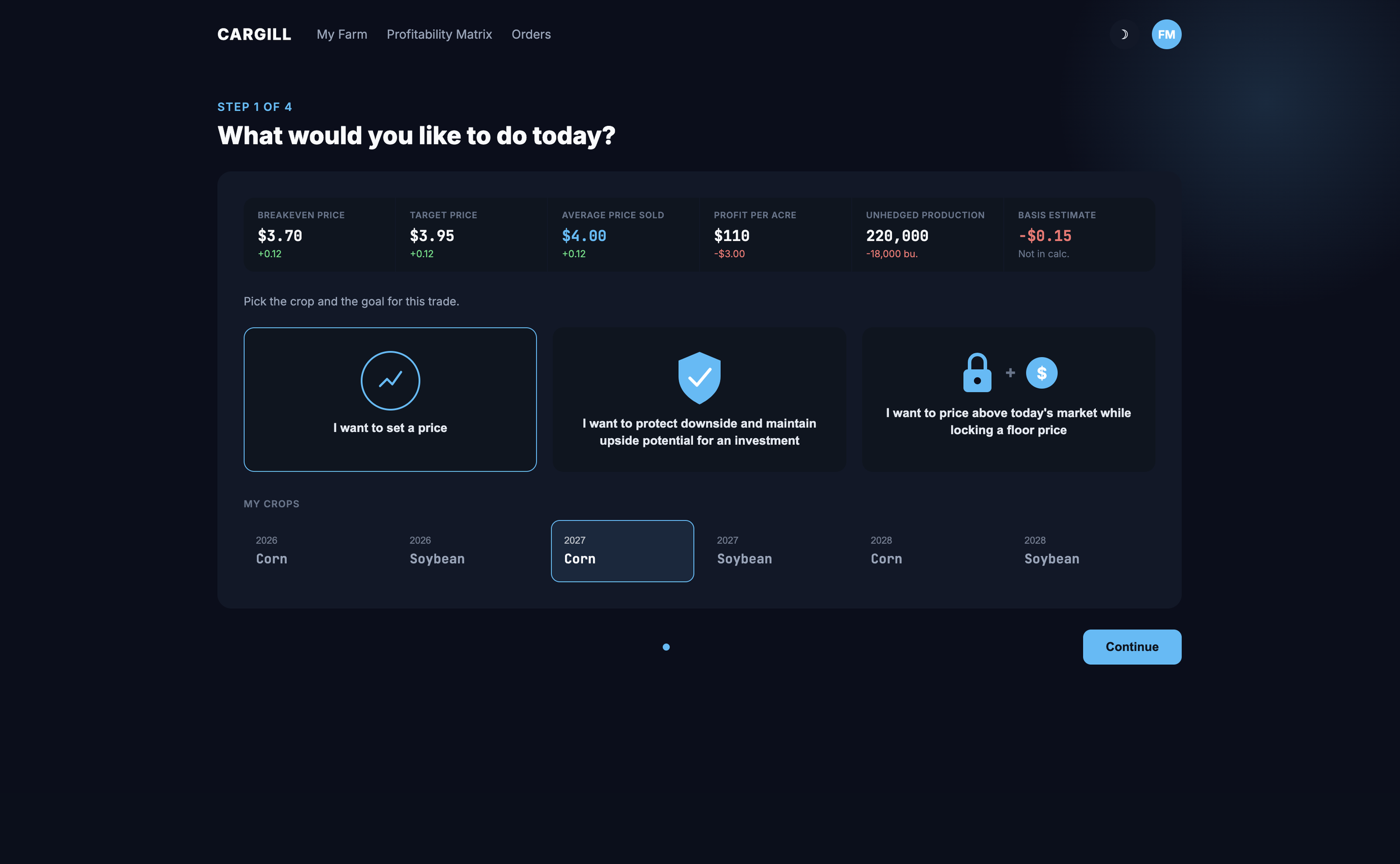
Outcome and Impact Metrics
The redesigned Cargill commodity trading platform helped bridge the gap between generations of farmers. While older farmers were initially hesitant to adopt new technology, the younger generation embraced it wholeheartedly, making it their go-to tool for tracking market prices and placing bids.
Younger Farmers Took to It Instantly
The new generation of farmers, who grew up with smartphones and apps, found the platform intuitive and easy to use. Many started using it almost exclusively, replacing phone calls and spreadsheets with real-time data at their fingertips.
One younger user shared, “This is exactly what we’ve been waiting for. I can check prices and make a trade while I’m out in the field—no more waiting on calls.”
Faster Decisions, Less Hassle
Before the redesign, farmers had to rely on phone calls, faxes, or handwritten notes to track prices and trade. The new system put everything in one place, making it easier to get information quickly and act on it.
Users appreciated the convenience, saying things like, “Now I don’t have to call three different people just to check prices. It’s all right here.”